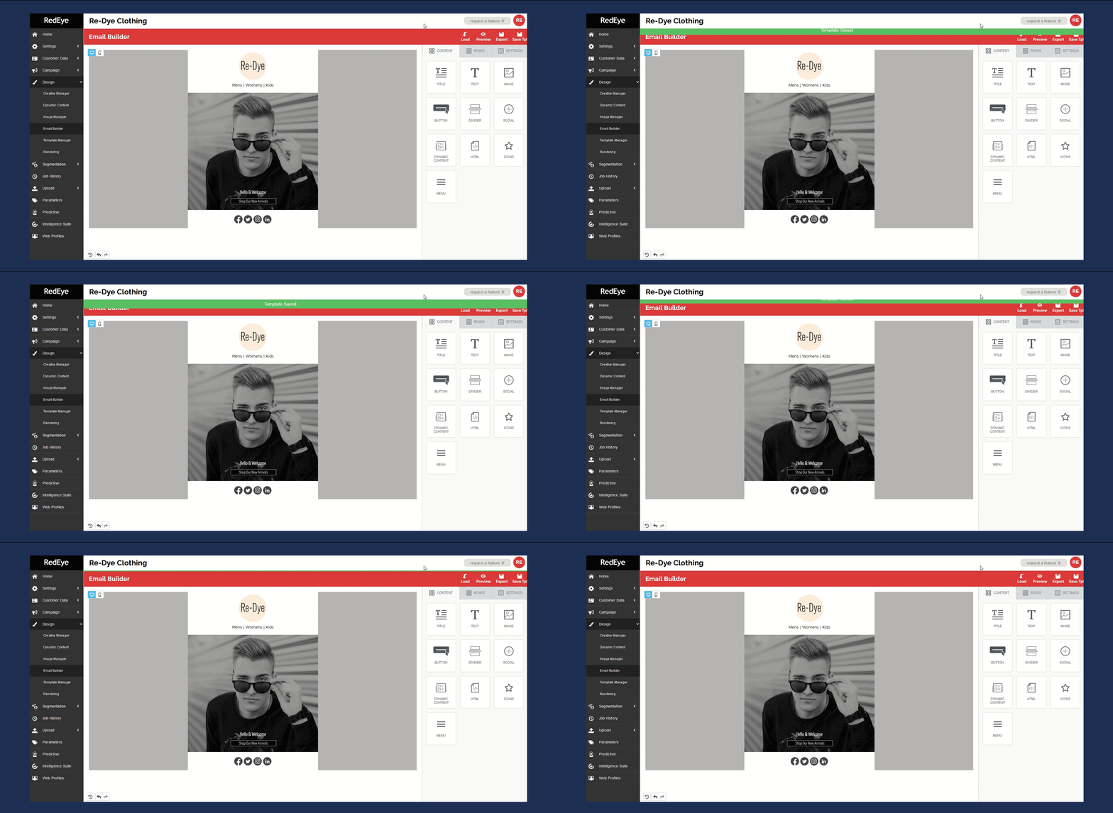
We’ve been working closely with users to add a multitude of new features to our drag and drop Email Builder, previously known as Template Builder.
Time is always of the essence when it comes to getting campaigns out the door. Each of our 8 new features is designed to allow you to create responsive and personalised creatives in record time. Let’s walk you through the new features.
1. Dynamic content
The biggest addition to Email Builder is our new dynamic content block. Simply select any of your pre-existing dynamic content that you want to include in your campaign to instantly tailor your campaign message. Before exporting, easily see how all your variants will be displayed when previewing your creative.
2. Mobile and desktop editing modes
With 40% of emails opened on mobile in 2020, designing a mobile first creative is essential (Litmus, 2020).
Previously it was cumbersome to repeatedly switch back and forth between previewing and editing your email to see how it would display across different devices.
To tackle this, we have introduced a new toggle function in the left-hand corner of Email Builder, allowing you to edit your creative in either desktop or mobile view.

3. Streamlined integration between Email Builder and Creative Manager
Exporting templates to Creative and Image Manager has now been streamlined. If templates with the same name already exist, you can overwrite them, meaning no more duplicate templates or images.
4. Autosave & save reminders
As a marketer you are always juggling tasks. That’s why we’ve added a save reminder and autosave feature to ensure your templates are saved every 2 minutes, meaning no matter what lands in your inbox, you can pick up where you left off.

5. Hiding rows feature
Want to vary how the desktop and mobile version of your creative look? We’ve added the ability to hide any content blocks from being displayed on either the mobile or desktop view of your creative with a simple toggle.
6. Column customisation
We’ve expanded the number of options when it comes to customising your columns. Add, remove or adjust the size of any of the columns by simply dragging the divider.

7. New menu options
Have you tried our new menu block? It’s now easier than ever to create a text-based navigation menu for your message or add a mobile optimised hamburger menu.
You no longer have to worry about column constraints, text size, or making sure your padding is just right. With every menu, a mobile-optimized version is generated automatically reducing the need to duplicate any content
8. Reverse stacking on mobile
By default, columns that are side by side will become stacked on a mobile device. Take control of how your email stacks with reserve stacking. Reverse the order of any row to create the desired flow for your email creative.


